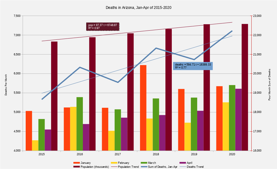
I put together the following visualizations from data reported on ADHS's COVID Dashboard. I've been copying their data to a personal spreadsheet so that I could view the day-to-day charts, which were not available early in AZ's reporting history. As their reporting has increased, I made these to visualize things they don't provide, and to help answer questions I had like "What time period does the current data accurately reflect?", "How large is the reporting delay?", "What are the effects of the state's COVID-19 response or major changes in people's behavior?", and "How long do I need to wait before the data is accurate enough to know that?".
As a disclaimer, I make no claim to the accuracy of the underlying data itself; I've worked to copy it as it was reported by ADHS. They've made changes at various times that have had significant impacts on the trends in the data. Further, due to the way ADHS makes this data available, it's extraordinarily difficult to simply copy and paste it. Although I've done my best to ensure I've accurately copied the reported data, it's possible I've made mistakes. I've published them here in the hopes they're useful to others, but without any warranty, implied or otherwise.
Note: I missed data for the following days: 17-Apr, 19-Apr, 22-Apr, 25-Apr, and 1-May. As a result, the "reported day-of" values are copied from the previous day, the "day-to-day change" for those days are necessarily zero, and the following day shows the delta relative two days prior.
Most sites report daily case counts as the change in running total. ADHS's summary page reports this as "Number of New Cases Reported today", i.e., today's sum - yesterday's sum. When ADHS reports "10 new cases today", it may be 1 case from four days ago, 2 cases from three days ago, etc. In April, ADHS began reporting cases by date of specimen collection, make it possible to visualize these delays in the charts below.
It's worth noting that even if ADHS could record/report a case the moment a person is tested or a death the very moment a COVID patient dies, there are still delays due to the time between from infected to symptoms to testing to results to death. Within 5 days, about 50% of infections show symptoms. After 14 days, that increases to around 90%. So if something happens that causes a lot of infections, it's a week before the first cases start showing up in the data, 2 weeks before we've recorded about half of those cases, and 3 weeks before the data records ~90% of those new infections. For this reason, I've shifted the timeline annotations in the chart forward 2 weeks.
ADHS reports a daily Epi Curve showing confirmed cases by date of specimen collection. These are a much more accurate view of the current data, but they're only the most recent snapshot. The following charts show how the entire curve has changed day-to-day by showing reported cases along two time axes: one shows when a sample was reported and the other shows the when sample was collected. The diagonal edge of the charts represents data reported as early as possible. In the "Cases Added" chart, bars farther from this diagonal represent larger delays between sampling and reporting.
On 11-June, ADHS added a net 1,254 cases; however, they did so by adding 7,065 and removing 5,811. 5,214 of these new cases were added to the 4th-10th. This change is visible in the non-diagonal ridge of the "Cases Added" graph. Note that "Added" and "Total" are log scale, while "Removed" is not.
On May 15th, approximately 1,200 previously unreported tests were added to previous days, as far back as mid-March.
On June 10th, they added more than 1,300 previously unreported tests, primarily affecting the period between 25-Apr and 12-May.
Monthly mortality numbers are provisional, and are delayed by approximately a month; While they will likely change after initial reporting, they are almost certainly an underestimate. The April release recorded 16,271 deaths in the first 3 months of 2020, whereas the May release increased those numbers to 16,623 deaths (+352) for the same time period. Here are the the number of deaths per month between 2015 and 2020: